The diagram below outlines the behaviour of the site as it renders across different screen sizes. The image on the left represents full sized devices, where the site is centered in the middle of the browser window with a max width of 1170 pixels.
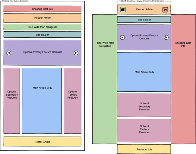
On the right, as the screen or browser width decreases (less than 992 pixels wide), elements begin to reorganise themselves to offer an enhanced experience for those customers. The shopping cart details and main navigation move off-screen and become visible by clicking  (the shopping cart) or
  (list menu) buttons respectively. In addition, elements that may have been rendered as columns become rows, as seen with the optional Secondary and Tertiary Feature columns above.