Article containers are responsive. As the screen or viewport width decreases (less than 992 pixels wide), the three column format of the secondary and tertiary feature columns shift to a stacked layout where the Body article is on top of the secondary and tertiary featured article containers.
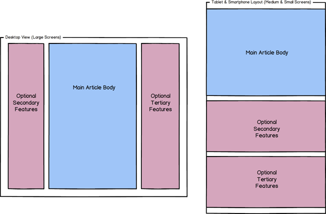
On smaller devices (less than 992pixels wide), the Body article, secondary and tertiary feature columns extend to the full width of the content area and have a maximum width of 720 pixels, depending on the size of the device.
On a full sized device (992pixels wide or more) these rows are arranged in columns, and share up to 1130 pixels of available horizontal space. The Body/Body with Search article will occupy 100%, 75% or 50% of the available width of the space depending on whether Secondary and/or Tertiary featured articles have been linked to it.
The following table outlines the amount of horizontal space that the Body/Body with Search article will occupy given different feature article configuration.
Article Configuration (more than 1200 pixel wide device) |
Available width |
No Secondary or Tertiary featured articles linked (100%) |
1130 pixels |
Either Secondary or Tertiary featured articles linked, or Promocode box enabled (75%) |
838 pixels |
Both Secondary and Tertiary featured articles linked, and/or Promocode box enabled (50%) |
546 pixels |
Article Configuration (between 992 pixel and 1200 pixel wide device) |
Available width |
No Secondary or Tertiary featured articles linked (100%) |
930 pixels |
Either Secondary or Tertiary featured articles linked, or Promocode box enabled (75%) |
688 pixels |
Both Secondary and Tertiary featured articles linked, and/or Promocode box enabled (50%) |
446 pixels |