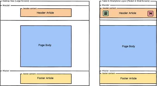
The parent containers for both the header and footer articles extend to the full width of the viewport or browser window. Background colours can be applied to these containers to create a full-width banner look.
/* apply a background colour to this element to create a full width banner */ #header { background-color: #F0F0F0; }
/* apply a background colour to this element to create a full width banner */ #footer { background-color: #F0F0F0; } |
The header and footer articles are centred in these containers and have up to 1170 pixels of available horizontal space – depending on the size of the device or viewport. The header and footer articles are contained in <div> elements with class names equal to .header-content and .footer-content respectively.

The header container is a special element. When the screen or browser width decreases (less than 992 pixels wide) toggle buttons appear that reveal the main navigation menu or the shopping cart information elements. These toggle buttons occupy 75 pixels of space on either side of the header. As a result, when the browser window or viewport is less than 992 pixels wide, the header article has 100% of this width available, minus 150 pixels (75 pixels on either side for each button).
For example, the iPhone 5 viewport is 320 pixels wide in portrait mode. As a result, the header article content or site logo cannot exceed 170 pixels:
320 px ( viewport width ) - 75 px ( space required for menu toggle ) - 75 px ( space required for shopping cart toggle ) -------- 170 px ( available width ) |
The .header-content element is also set with a minimum-height value of 125 pixels.