All search result formats are responsive, which means that as the viewport or device width changes, the layout of the search result data shifts so that the customers are not forced to resize the browser window to view important information.
The screenshots and behaviour described in the search result format pages represent what the search result formats look like on the majority of mid-sized and larger devices that exceed 515 pixels – most tablets, laptops and desktop computers.
For devices smaller than 515 pixels – most smartphone devices – each result format looks a little bit different:
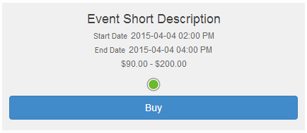
Standard Format |
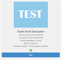
Detailed Format |
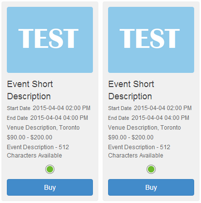
Grid Layout Format |
|
|
On screens smaller than 768 pixels wide, only two result members appear on each row |
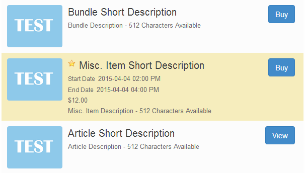
Search results that are activated via a promotion code will appear with a yellow background and the promotion code star indicator next to the item’s 'Short Description'. This yellow background is applied using the CSS selector .active-promo-event: