Very little has to be done out of the box to ensure that your site is responsive. By default, the core global stylesheet for the website has all that is required to render each page differently depending on the size of the browser window; however, there is one piece of configuration that should be in place before the website will scale content correctly:
1.Open Content Management from the Desktop.
The Sites|Search page appears.
2.Search for and select the site that you want to work with.
The Sites|Basic page appears.
3.Select the Applications tab.
The Sites|Applications page appears.
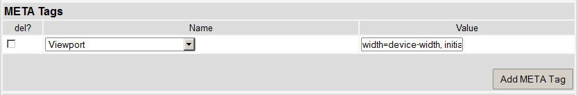
4.Click 'Add META Tag'.
A meta tag row appears.
5.Select the viewport from the 'Name' dropdown.
6.Enter width=device-width, initial-scale=1 in the 'Value' field.
7.Click 'Apply'.
A window confirms that the site was updated.
8.Click 'OK'.
The resulting configuration will ensure that the following meta tag is rendered on all pages of the ecommerce site.
<meta name="viewport" content="width=device-width, initial-scale=1">