•Specifying Kiosk Banner Colours
•Specifying Kiosk Calendar Colours
•Specifying Kiosk Button Colours
The colour of every component, within the k is defined within a rule. These rules are defined within the brand.css style sheet.
To change the colour of a component, change the existing colour values within the corresponding rule’s colour properties. These properties are typically background-color or color, and the corresponding colour values are typically in HEX. You can, however, also use RGB or plain language colour values.
|
Information For example, to change the main banner from orange to red, you would change the value of the background-color property, within the .mainBanner rule, from #F47421 to #FF0000. Thereby, resulting in the following rule: .mainBanner {background: :#FF0000;} |
To modify the kiosk colour definitions, perform the following:
1.Determine the colour combinations you want to use for the kiosk.
2.Obtain the HEX, RGB or plain language values for these colours.
3.Change the current colour definitions, within the brand.css style sheet.
Specifying Kiosk Banner Colours
The default colour definitions within the kiosk banners include the following:
Component |
Rule |
Property |
Default |
 |
.mainBanner |
background |
#F47421 |
 |
.alphabetBannerBg_on |
background-color |
#003B77 |
 |
.alphabetBannerBg_off |
background-color |
#F47421 |
Alphabet Banner Text |
.alphabetBanner |
color |
FFFFFF |
Specifying Kiosk Calendar Colours
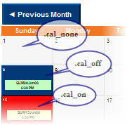
The components within the calendar include the following:

These colour definitions are defined within the following rules:
Rule |
Property |
Default |
.calendar |
background-color |
#C0C0C0 |
.cal_off |
background-color |
#003B77 |
.cal_on |
background-color |
#FF0000 |
.cal_none |
background-color |
#F5F5F5 |
Specifying Kiosk Button Colours
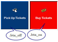
The colours corresponding with the buttons within the kiosk depend on whether the button is clicked or not.
For example:

These colour definitions are defined within the following rules:
Rule |
Property |
Default |
.btn_off |
background-color |
#003B77 |
.btn_on |
background-color |
#FF0000 |
